Plug-and-play React Flow components that just work

Overflow is a React Flow component library for advanced diagram logic and interactions. Built to save hundreds coding hours.
React Flow component library
Full source code
No vendor lock-in
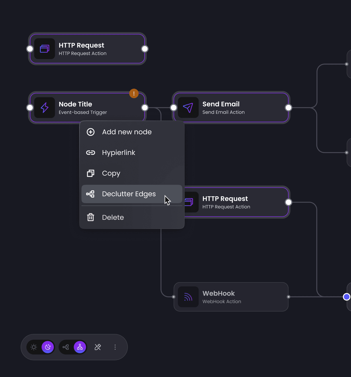
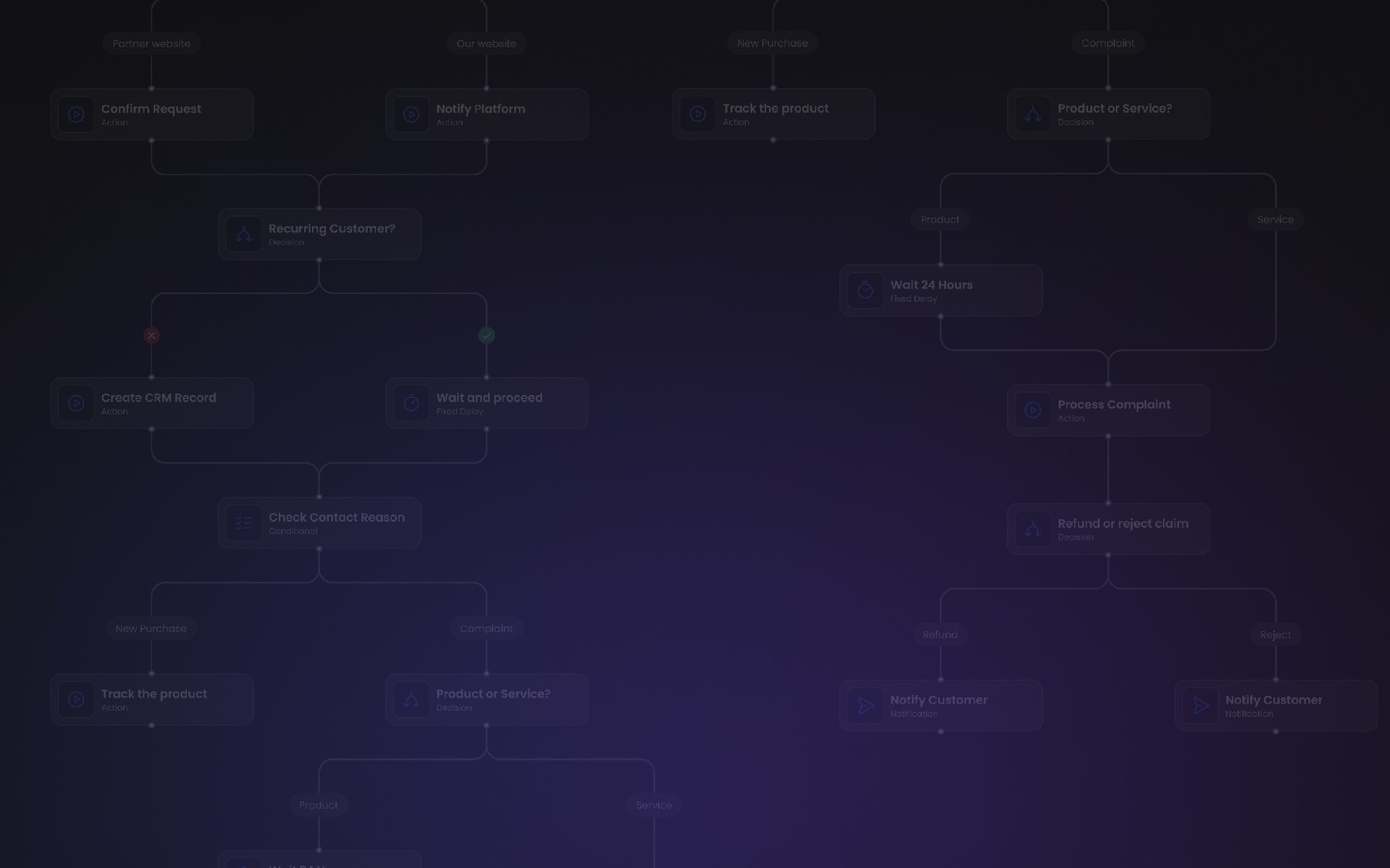
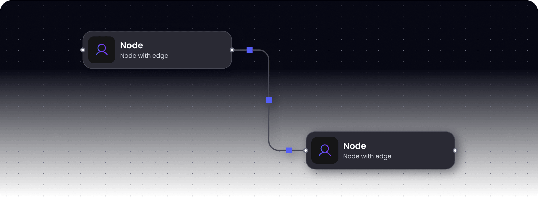
Interaction Components


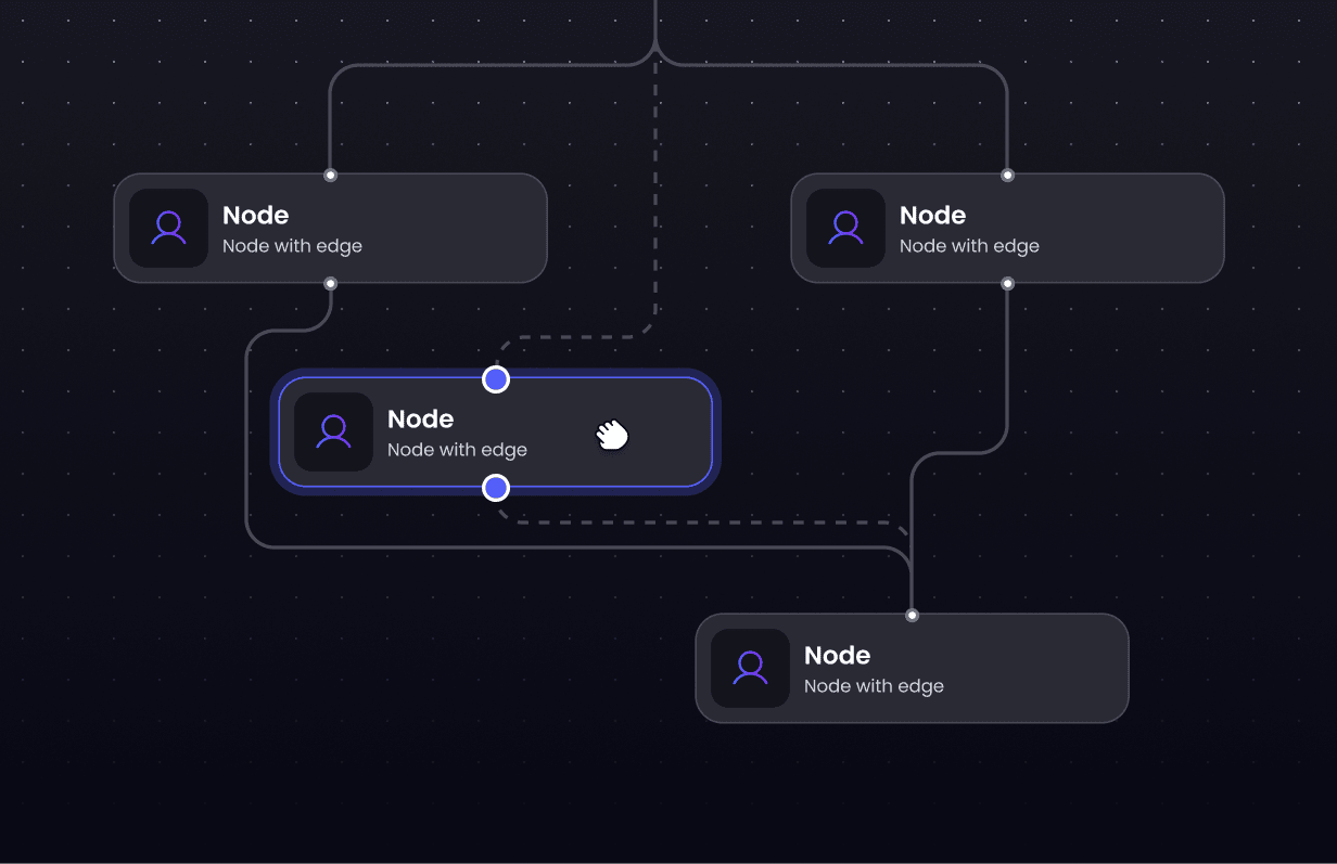


50+ production-ready components available
Why our React Flow Components Library?

“Teams kept re-creating the same missing features in React Flow instead of moving forward. Overflow delivers those features saving time and letting them focus on the code that really matters to their business.”

Mateusz Jagodziński
Delivery Lead and Overflow Contributor, Synergy Codes

You shouldn’t waste months reinventing what already works
Perfect for workflow builders, data tools, and dashboards
Works for AI orchestration, conversational AI or AI analytics platforms
Developer-driven innovation
Production ready components created by a team of diagramming experts that understand the complex challenges of UI development. Overflow library helps you ship faster, without rewrites and 3 a.m. debugging.
Fully customizable set of React Flow components
Designed with flexibility in mind. Built on two powerful pillars – open-source UI components and Interaction components.


Build vs. buy for React Flow: time and complexity risks


Take your visualizations further with Overflow and Workflow Builder
Overflow components transform visualization products. Workflow Builder showcases this perfectly - a white-label workflow app that integrates Overflow to handle advanced use cases that standard libraries can't.
Extensible flow diagram builder for your React Flow project.
Why developers trust Overflow library?
Overflow components have been used across multiple industries – from SaaS platforms to automation tools – to help developers reduce setup time and scale faster.
Pro-grade support for Interaction components
Direct access to engineers, fast answers on tricky edge cases.
Flexible deployment
Full source code, no vendor lock-in, fits monorepos, custom pipelines and Workflow Builder platform.
Clean API and first-class TypeScript
Explicit types, predictable props, comprehensive examples.
Permissive licensing
MIT for free UI components; one-time payment for perpetual license with full source for Interaction components.
Lean footprint
Small package size, minimal dependencies, tree-shakeable builds.
Performance at scale
Designed for large diagrams and optimized to avoid becoming the bottleneck, so loading big projects and moving objects stays smooth.
Case study
Edge Reshaping component for RE:SOLVR
RE:SOLVR, a Swedish startup specializing in business transformation, needed to enhance their React Flow-based diagramming tool with intuitive edge reshaping capabilities. The solution had to integrate seamlessly with their existing setup without compromising performance or breaking current features.
The solution
Our team delivered a clean, dependency-free Edge Reshaping component through a smooth and efficient collaboration process.
The implementation included:

Clean React Flow code with zero external dependencies
Full compatibility with existing features (context menus, directional arrows)
Flexible adaptation to RE:SOLVR's specific technical requirements
Comprehensive handover with code walkthrough
4-week bug-fixing guarantee
Clear, transparent communication throughout the project
The impact

Zero performance degradation on complex diagrams
100% feature compatibility maintained
Seamless integration enabling faster progress without rework
Reduced review time for new UI component integration
Sustainable solution with no vendor lock-in

Synergy Codes understood our technical requirements immediately and delivered exactly what we needed – a lightweight, maintainable solution that works flawlessly with our existing React Flow setup. Their professional approach and clear communication made the entire process smooth and efficient.
Innovation never stops – and neither do we
We’re continuously refining and expanding our library, working closely with developers to ship better, faster, and more intuitive UI components.
Let’s talk.
FAQ
- What is React Flow?
React Flow is a library for building node-based editors and interactive graphs in React. Overflow extends it with production-ready components.
- What is included in Overflow Interaction components?
You get the feature implementation (full source code), usage examples, API and types, and concise documentation per component.
- How do Overflow components integrate with existing React Flow projects?
Most components expose a single-entry point (a hook, function, or component). Copy the source into your project, wire the entry point, and adapt to your graph. Advanced components may require a few extra steps (documented in their pages).
- How much engineering time can we save on edge reshaping, autolayout, and edge routing versus building in-house?
Typical ranges from real projects:
Feature (React Flow)
Reshaping orthogonal edges
Autolayout
Grouping/ ungrouping + advanced autoresize
In house developent hours
80–120 hours
40–60 hours
120–240 hours
Overflow integration hours
6–12 hours
4–6 hours
8-12 hours
For a detailed comparison, see the full chart.
- How customizable are styles, theming, and UX to match our design system?
Interaction components focus on logic and ship with full source code – modify behavior or styling as you like. UI components use CSS variables, so you can apply your design system by updating a single theme file.
- What support is available for Interaction components (channels, response times, escalation)?
Direct contact with our engineers; typical first response within 24 hours on business days.
- How are updates delivered (changelog, semantic versioning), and how do we migrate safely?
Open-source packages follow a clear changelog and semantic versioning with migration notes. Because you receive full source code to Interaction components and may modify it, migration steps can differ by project. We offer a bug-fix window and guidance to help you update safely.
- Why Overflow if React Flow examples exist?
React Flow examples show possible approaches, not production coverage. They omit edge cases, performance considerations, and maintenance paths. Overflow gives you the end result: hardened behavior, documented APIs and types, and components that are ready to ship.
- How does Workflow Builder relate to Overflow?
Overflow delivers components you integrate feature-by-feature. Workflow Builder is a white-label editor that includes Overflow and a ready architecture. Start with components for granular control or choose the platform to accelerate time to market.
- What is your licensing model?
UI components are open source (MIT). Interaction components are a one-time payment with full source code and no vendor lock-in.
